The Dungeon
Brand identity for The Dungeon, a board games club and shop: hand-drawn lettering, a watchful dragon eye and worn textures that invite one more round.
- Branding
The Dungeon is a place for board game nights, campaigns and long tabletop battles. The brand needed to capture the thrill of adventure and a little danger, while still feeling warm and welcoming enough to bring friends back week after week.
Art direction
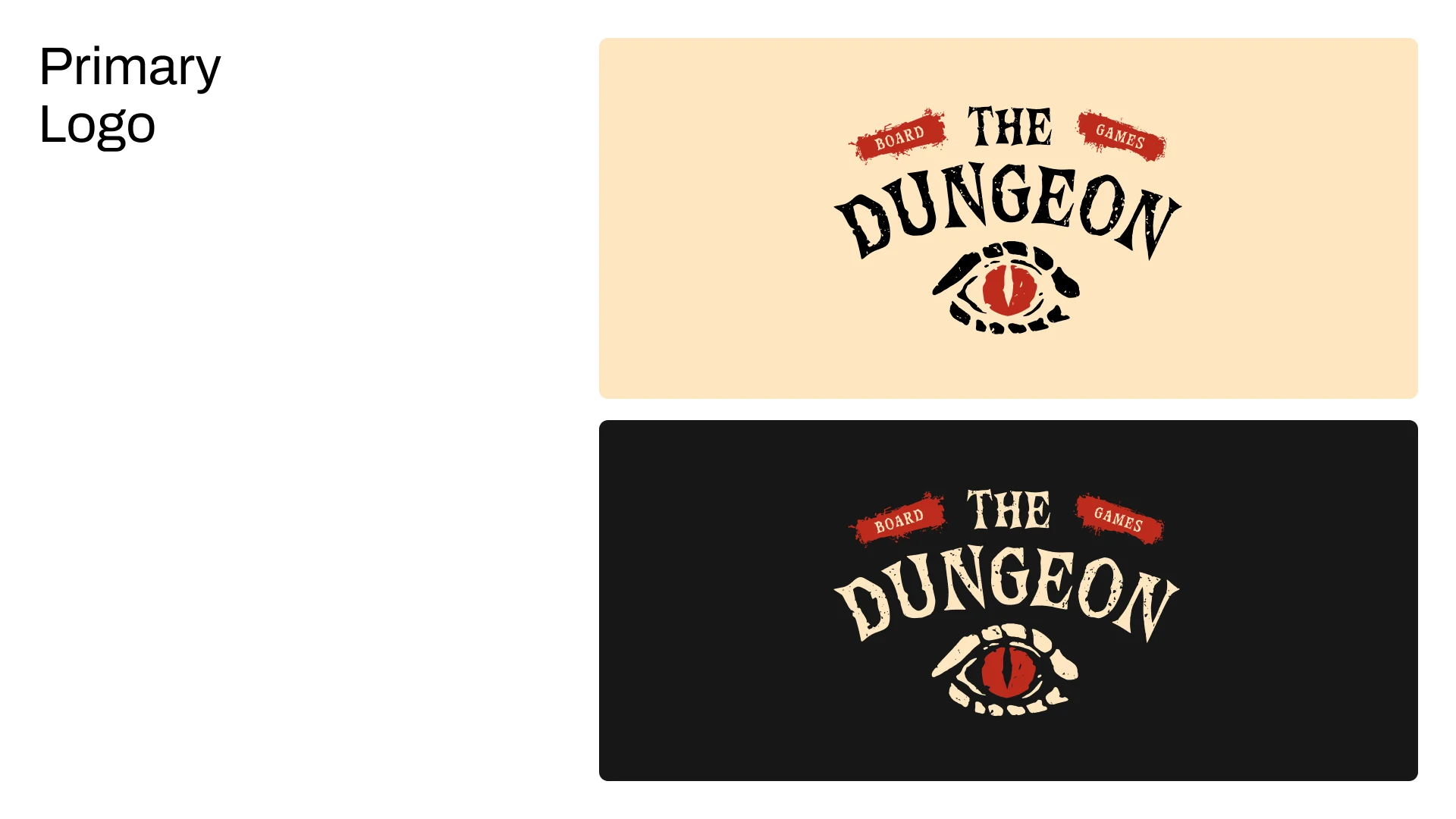
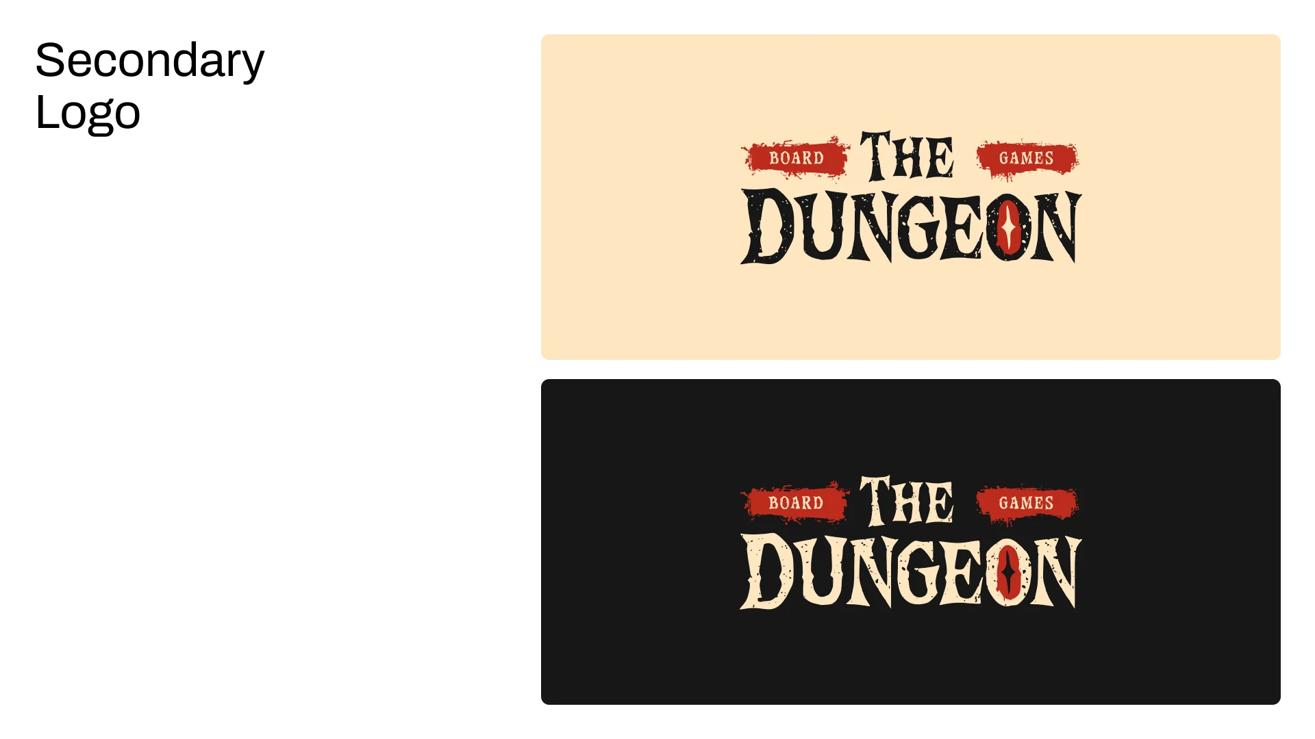
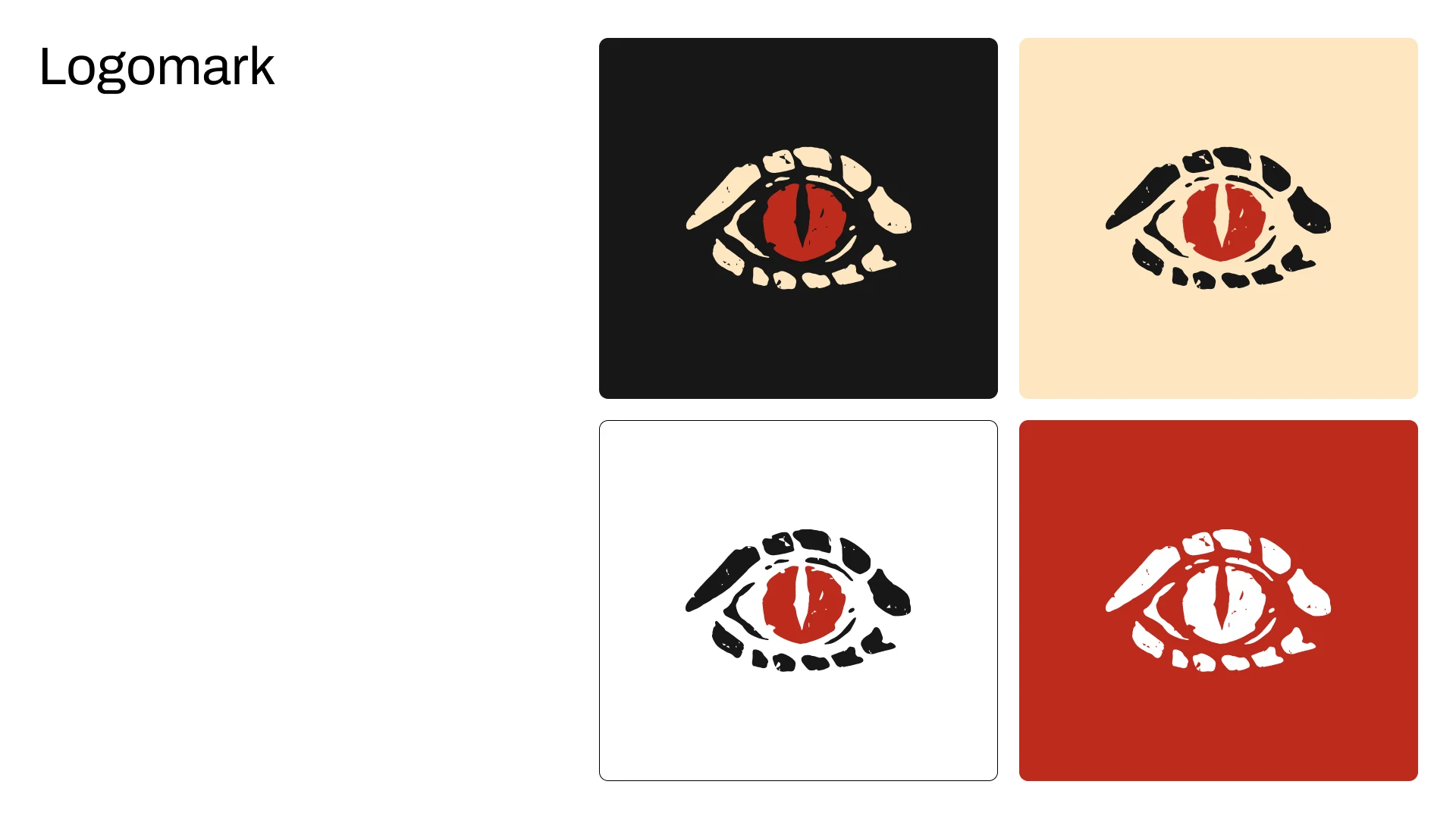
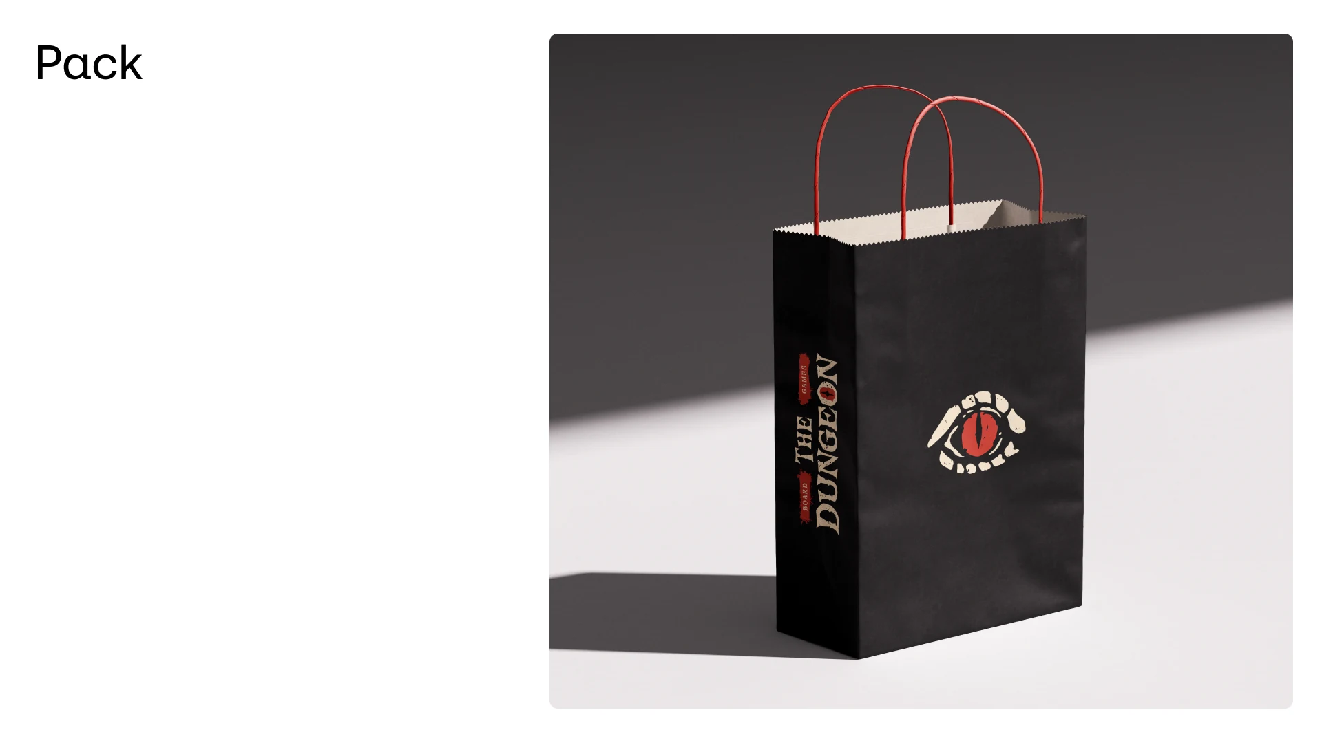
The identity is built around a watchful dragon eye, a symbol of mystery and the quest waiting on the table. It sits beneath hand-drawn, slightly weathered lettering, with “Board” and “Games” set on torn red banners. A compact horizontal version hides the eye inside the letter O for signage and narrow formats.
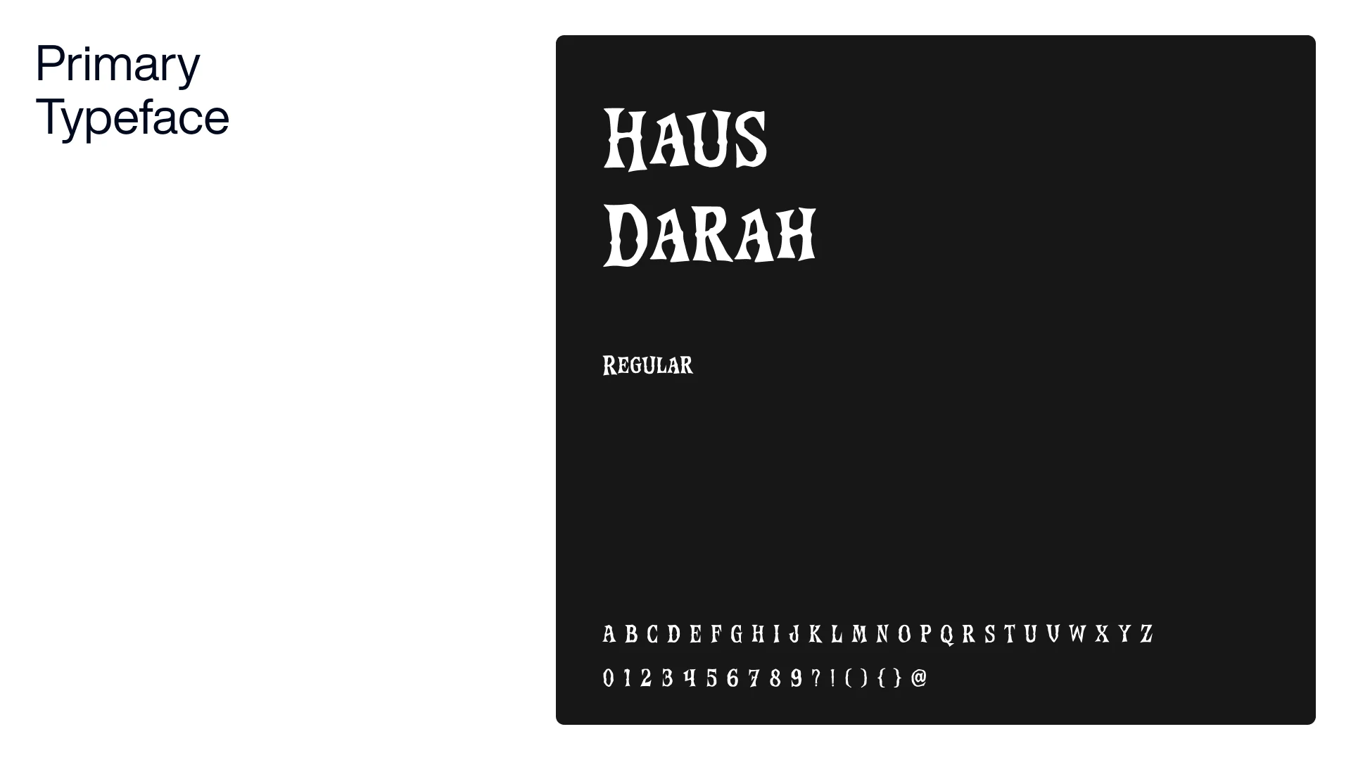
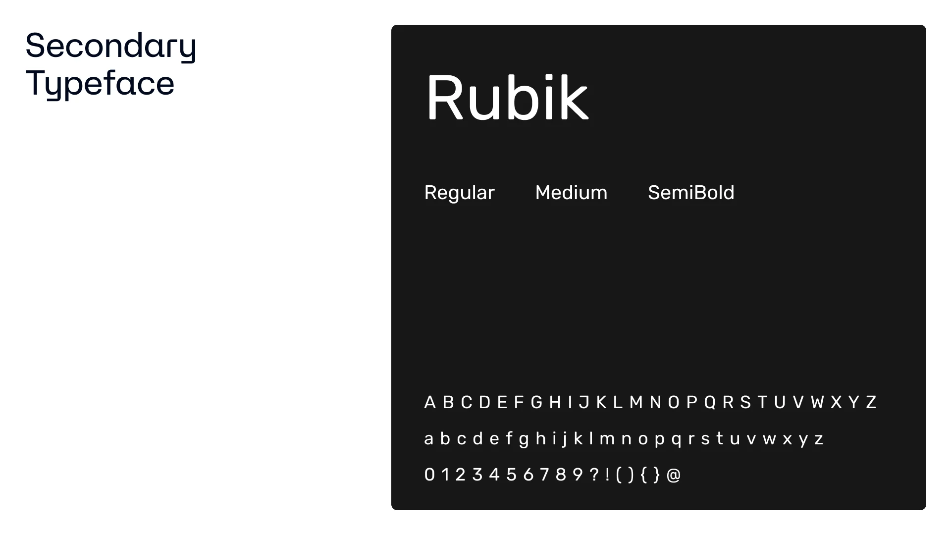
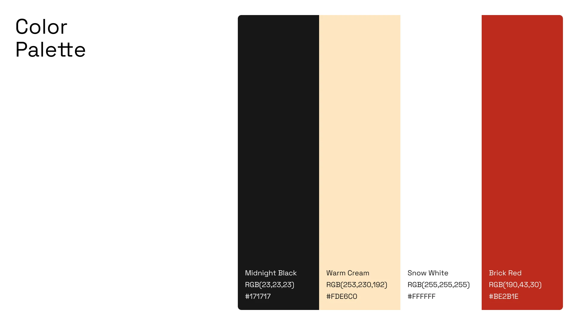
Haus Darah brings a dark-fantasy, storybook character to headlines, while Rubik keeps menus, schedules and everyday information clear and easy to read. The palette of Midnight Black, Warm Cream and Brick Red recalls old parchment, candlelight and a dragon’s glare.
Creative process
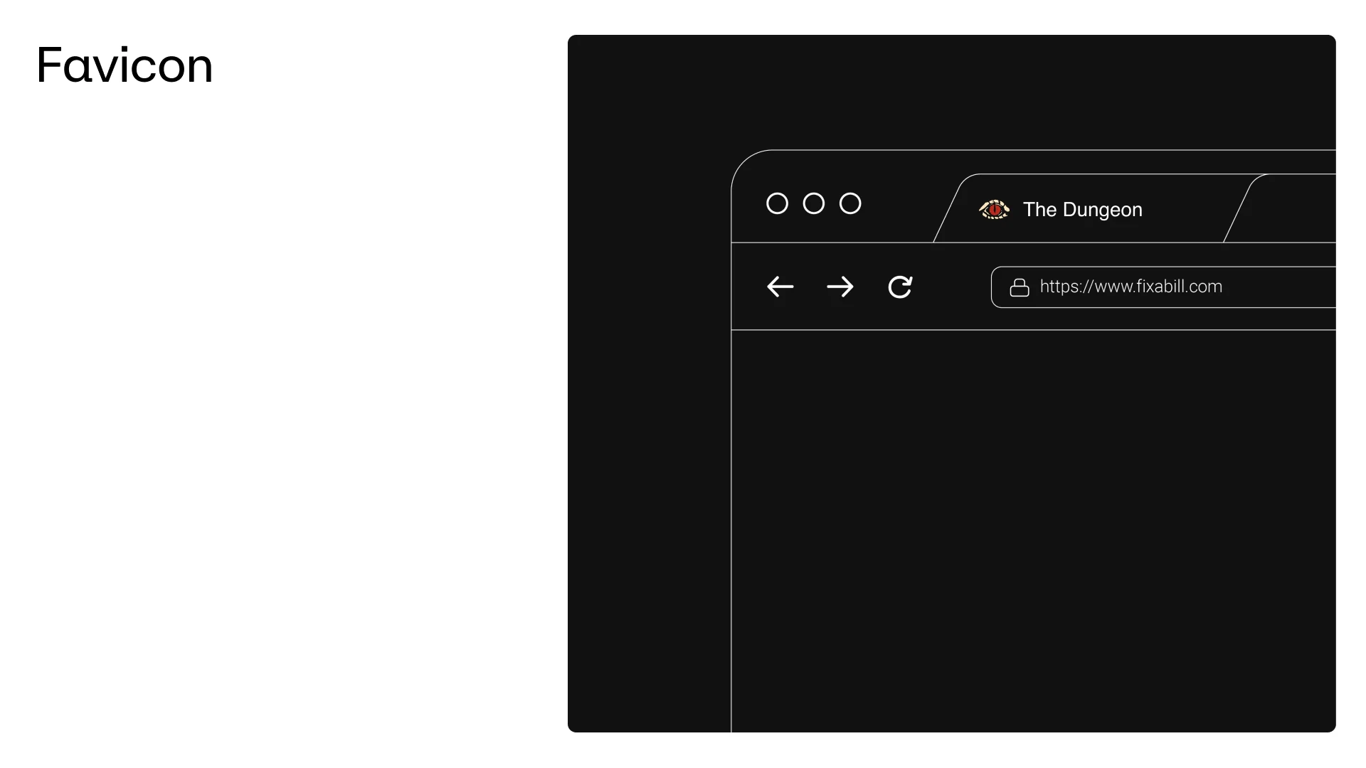
We started from the dragon eye and worked outwards, testing each element in the places the brand lives: a browser tab, social media and the bag customers carry home after a new game.
The worn textures and torn edges make every touchpoint feel like part of the same adventure.
The Dungeon now has a bold, memorable identity that feels as exciting as the games on its tables, and as welcoming as the community around them.