Cargo Jet
A complete brand identity for Cargo Jet, built around speed: a forward-leaning wordmark, a bold orange and navy palette, and arrow patterns that move across app, signage and merch.
- Branding
Cargo Jet moves parcels quickly and reliably, and its brand had to say exactly that. The company needed an identity that works across very different environments: a mobile app, pickup and drop-off points, packaging and printed materials.
Art direction
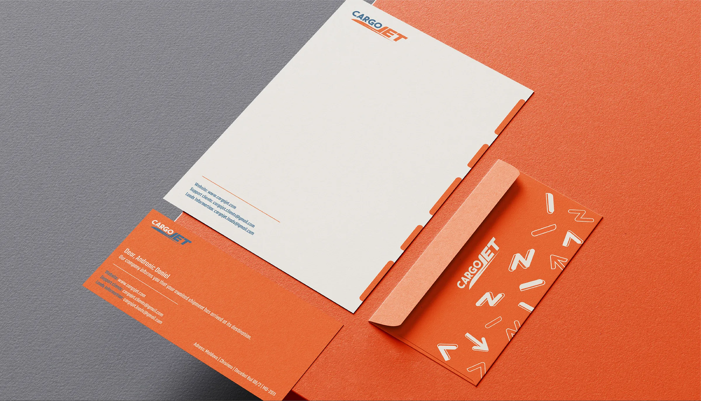
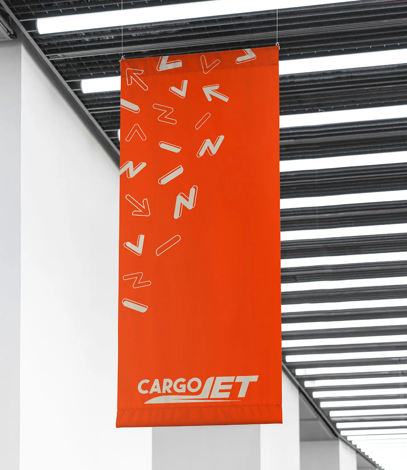
The forward-leaning wordmark and arrow patterns create a constant sense of motion. A bold orange and navy palette provides high visibility for signage and packaging while staying clean and professional in the app.

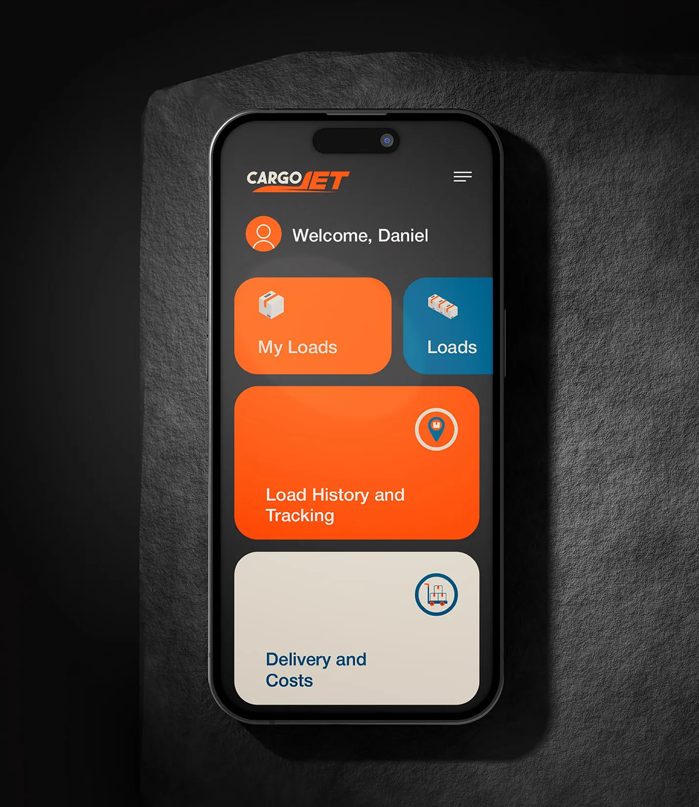
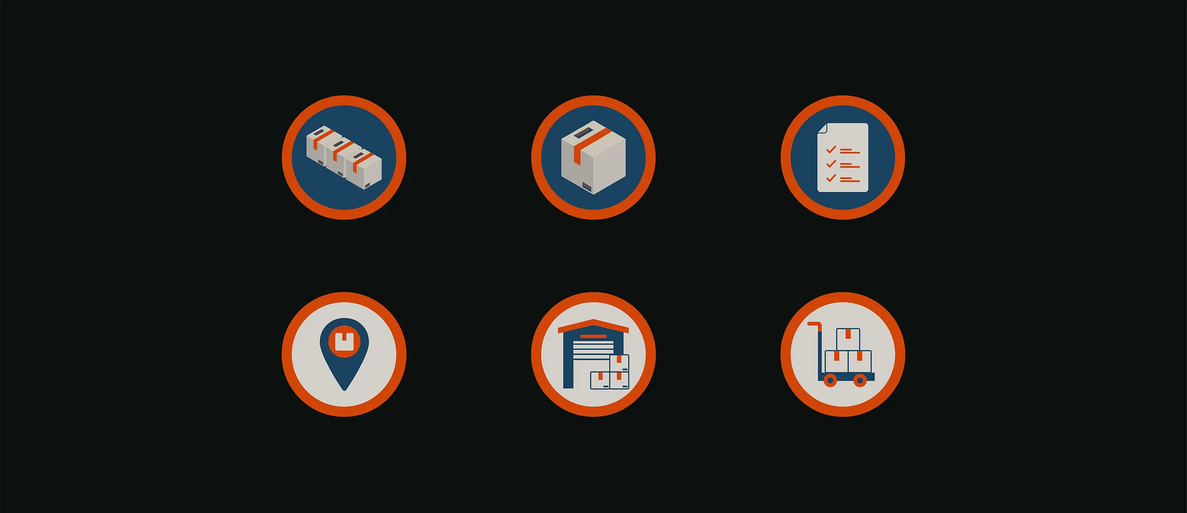
A custom icon set gives the brand a consistent visual language for services, directions and notifications.



Creative process
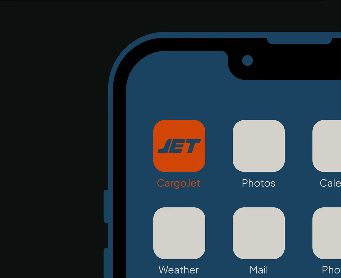
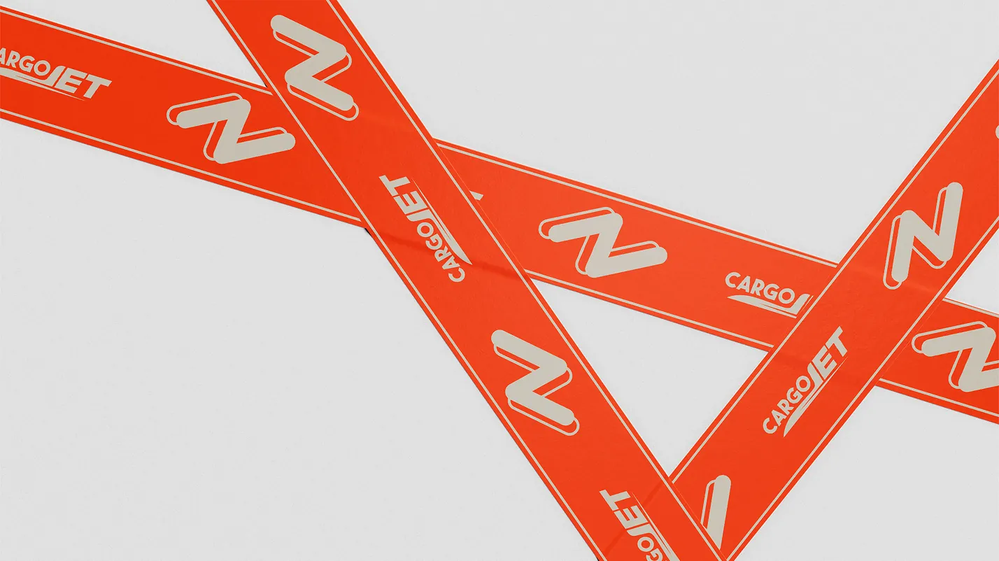
We designed the identity to work in the real world first: deposit and pickup signs that are easy to spot, branded tape that turns every parcel into advertising, and an app icon that stands out on a phone.
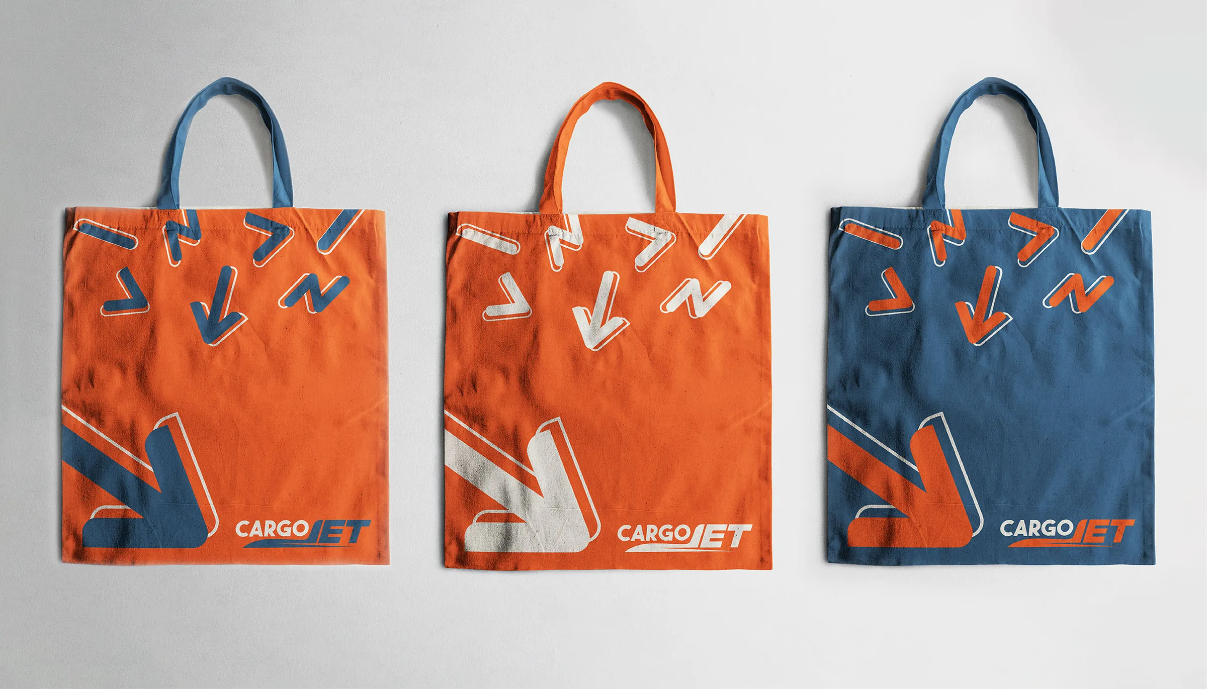
The same system then extends to stationery, banners and merchandise, so every interaction with Cargo Jet feels like the same fast, dependable company.
Cargo Jet now has a recognisable, practical identity that works as hard in the warehouse as it does on a phone screen.