Fixabill
A complete brand identity for Fixabill, featuring a modern, sophisticated visual style that communicates trust, simplicity, and professionalism across all touchpoints.
- Branding
- Social Media

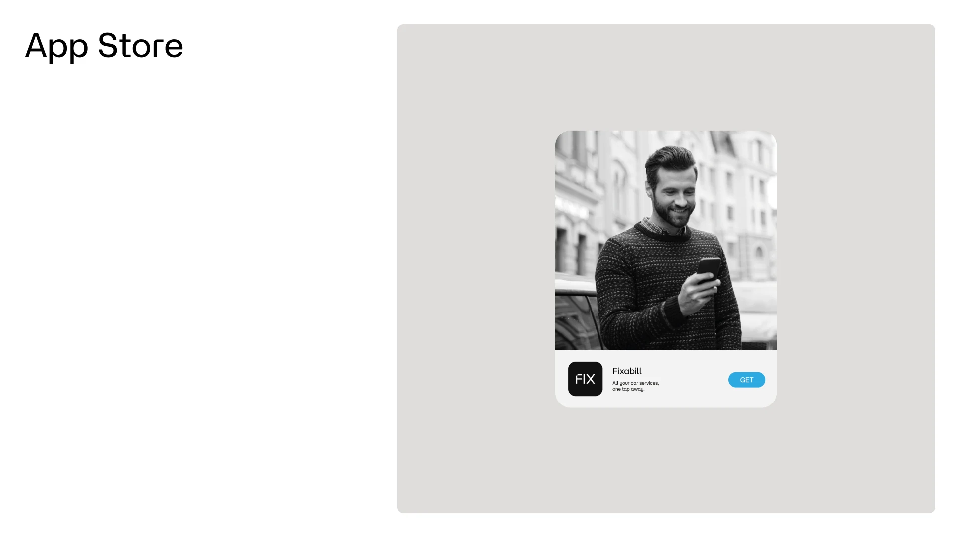
Fixabill needed a brand that would make a digital service feel reliable from the very first tap. In a crowded app store, users decide in seconds whether a product looks trustworthy, so the identity had to communicate simplicity and professionalism before a single feature was explained.
Art direction
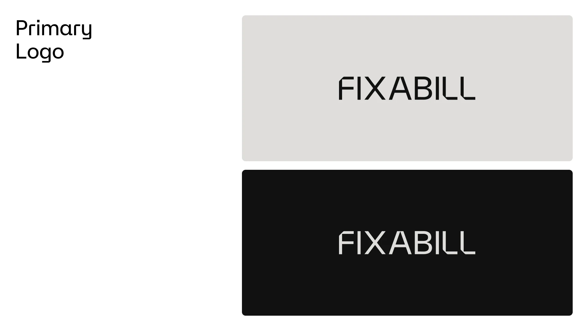
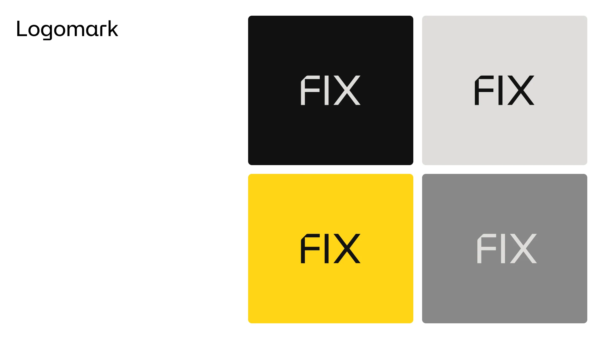
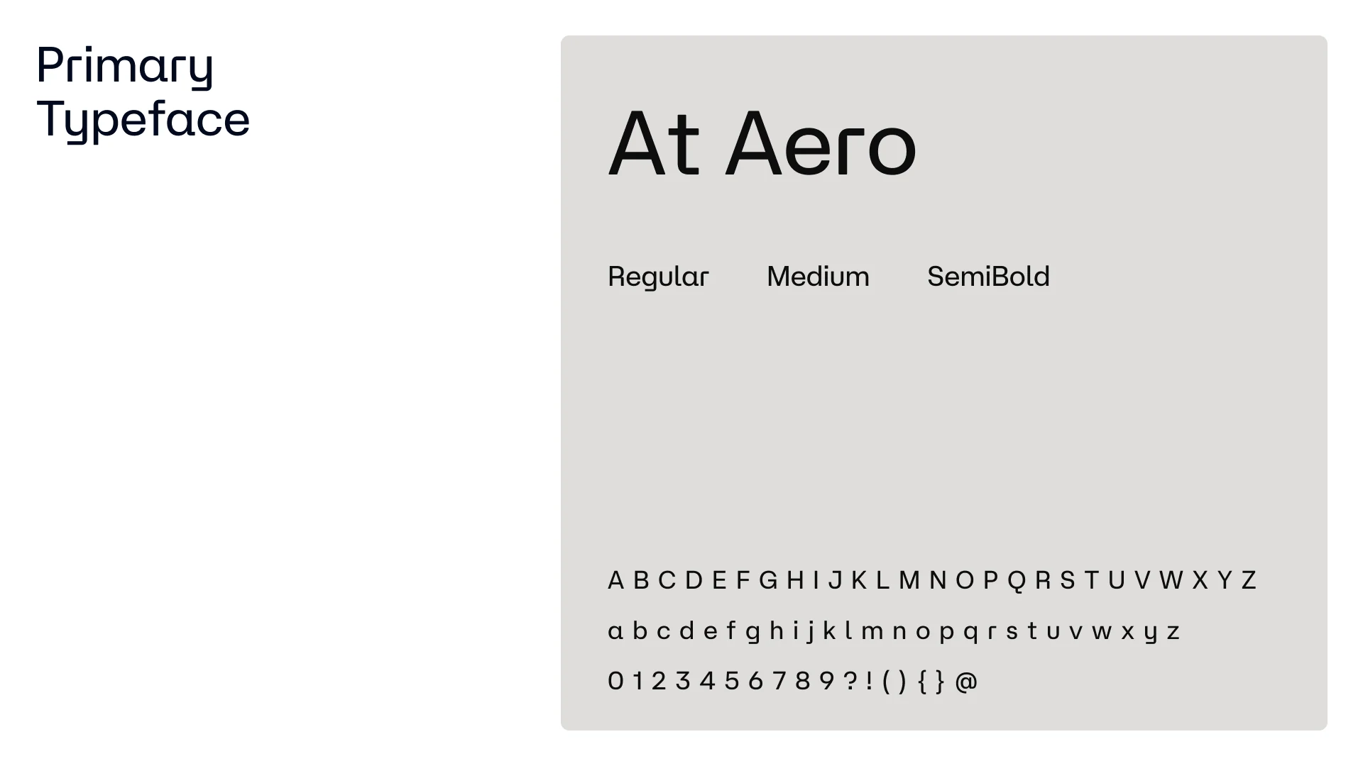
We built the identity around restraint: a clean, engineered wordmark with a distinctive cut through the final letters, and a compact FIX logomark for app icons and small formats. Set in At Aero, the typography feels modern, precise and easy to read on any screen.
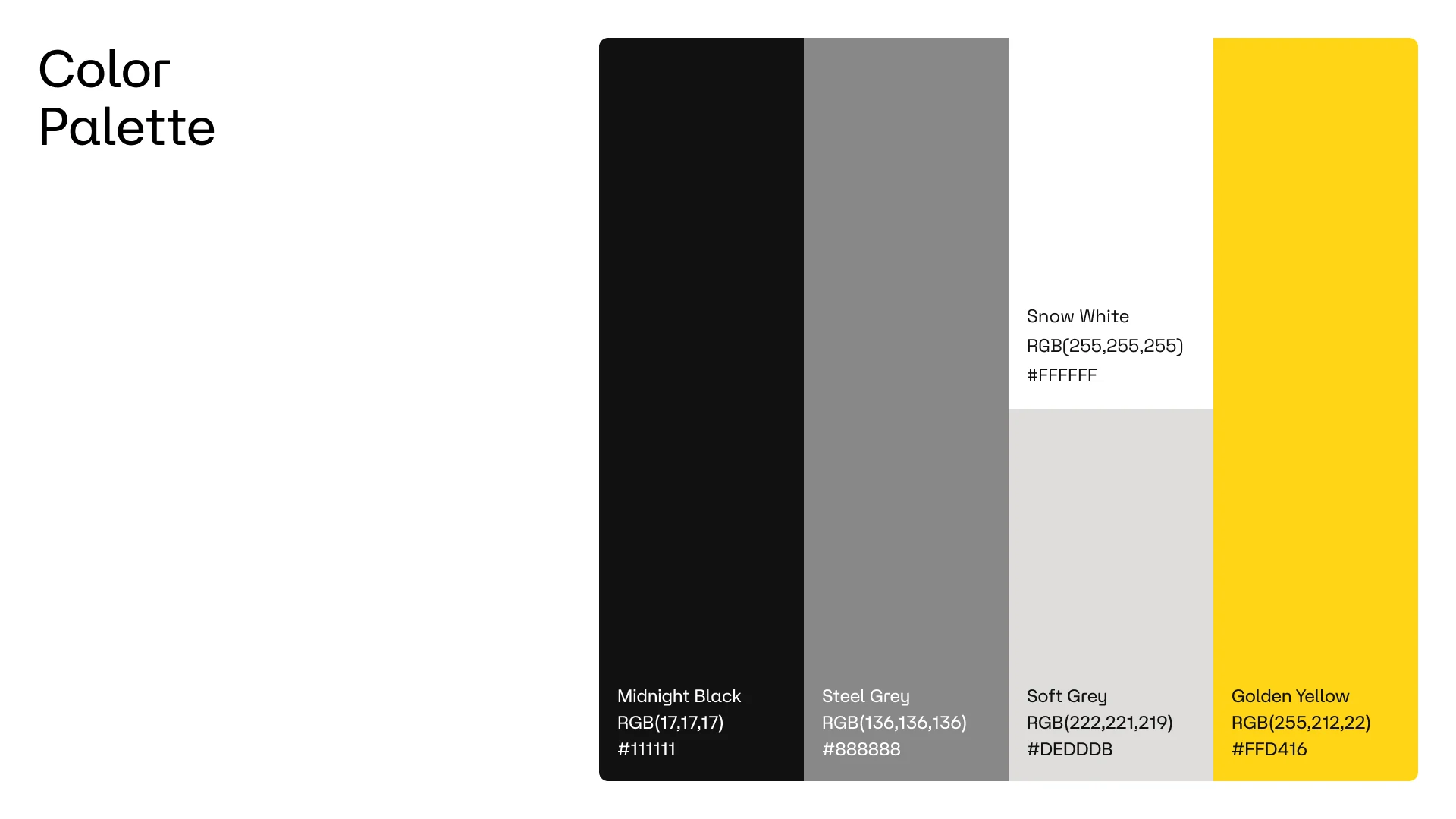
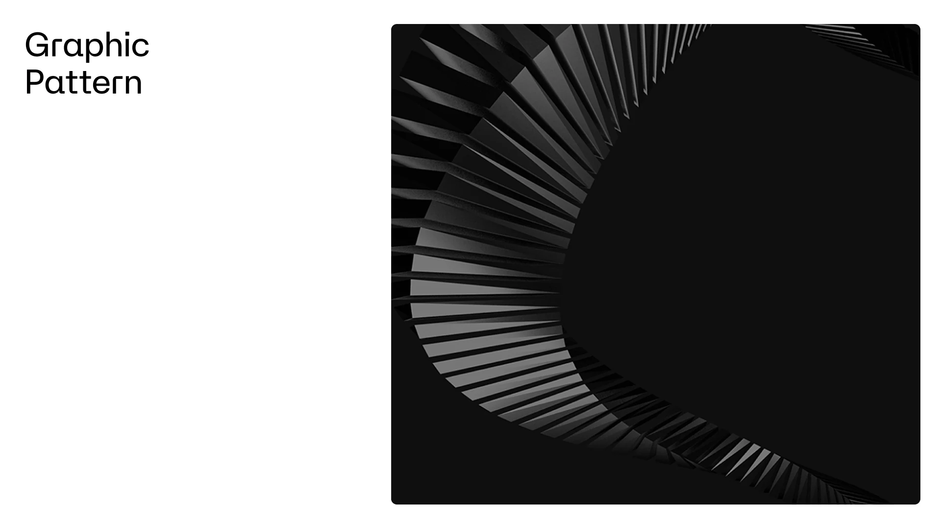
A monochrome palette of Midnight Black, Steel Grey, Soft Grey and Snow White gives the brand a composed, premium feel, while Golden Yellow is used sparingly as a signal colour. The radial line pattern adds movement and depth to key visuals, turning a minimal system into something recognisable at a glance.
Creative process
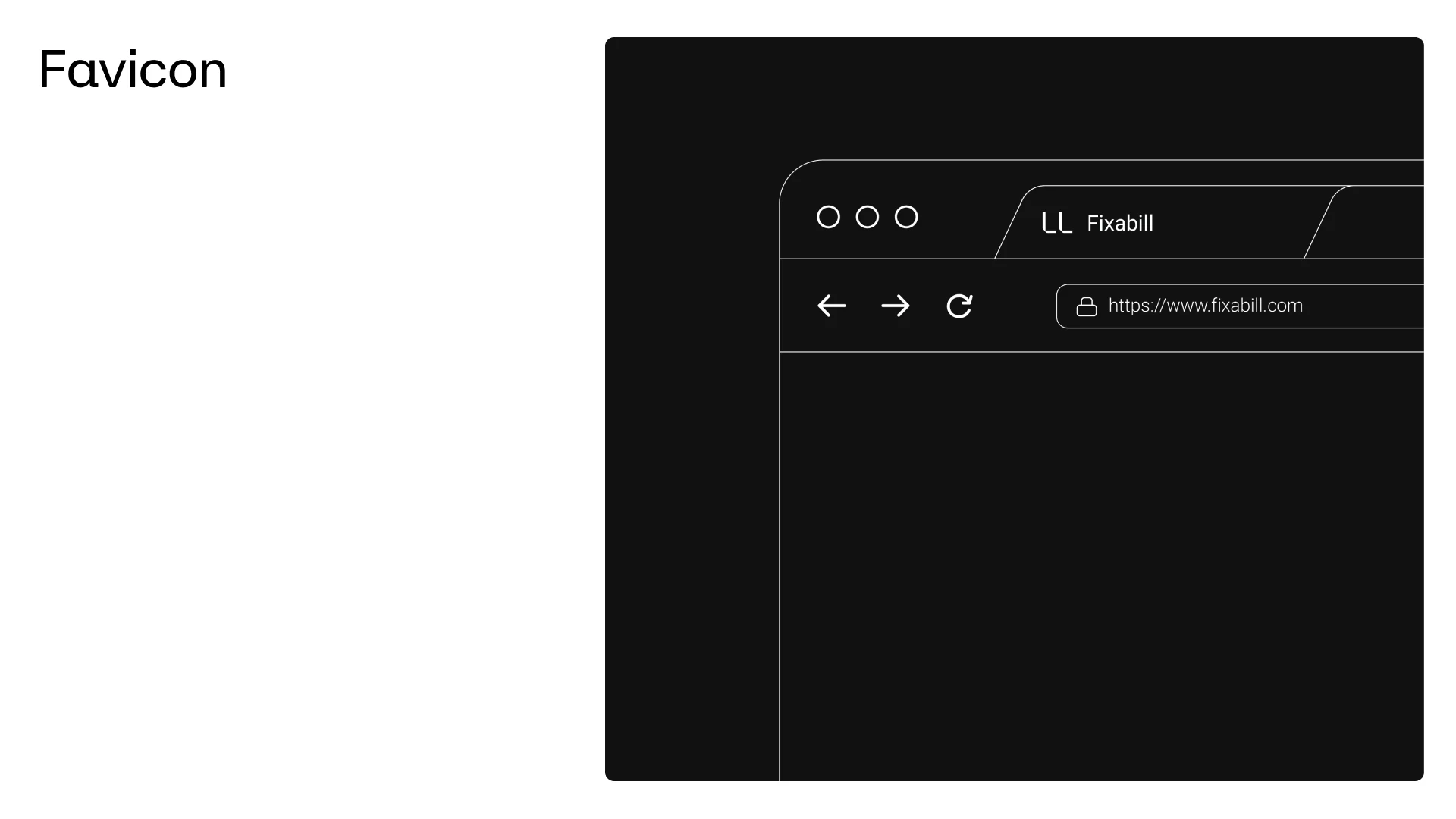
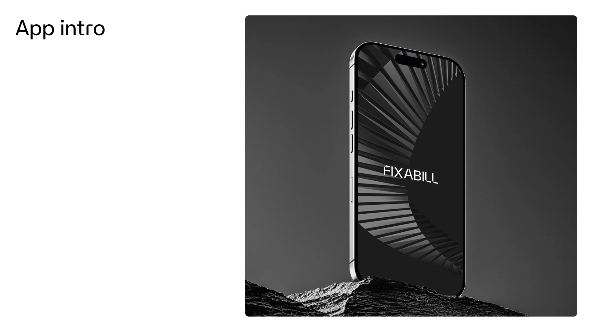
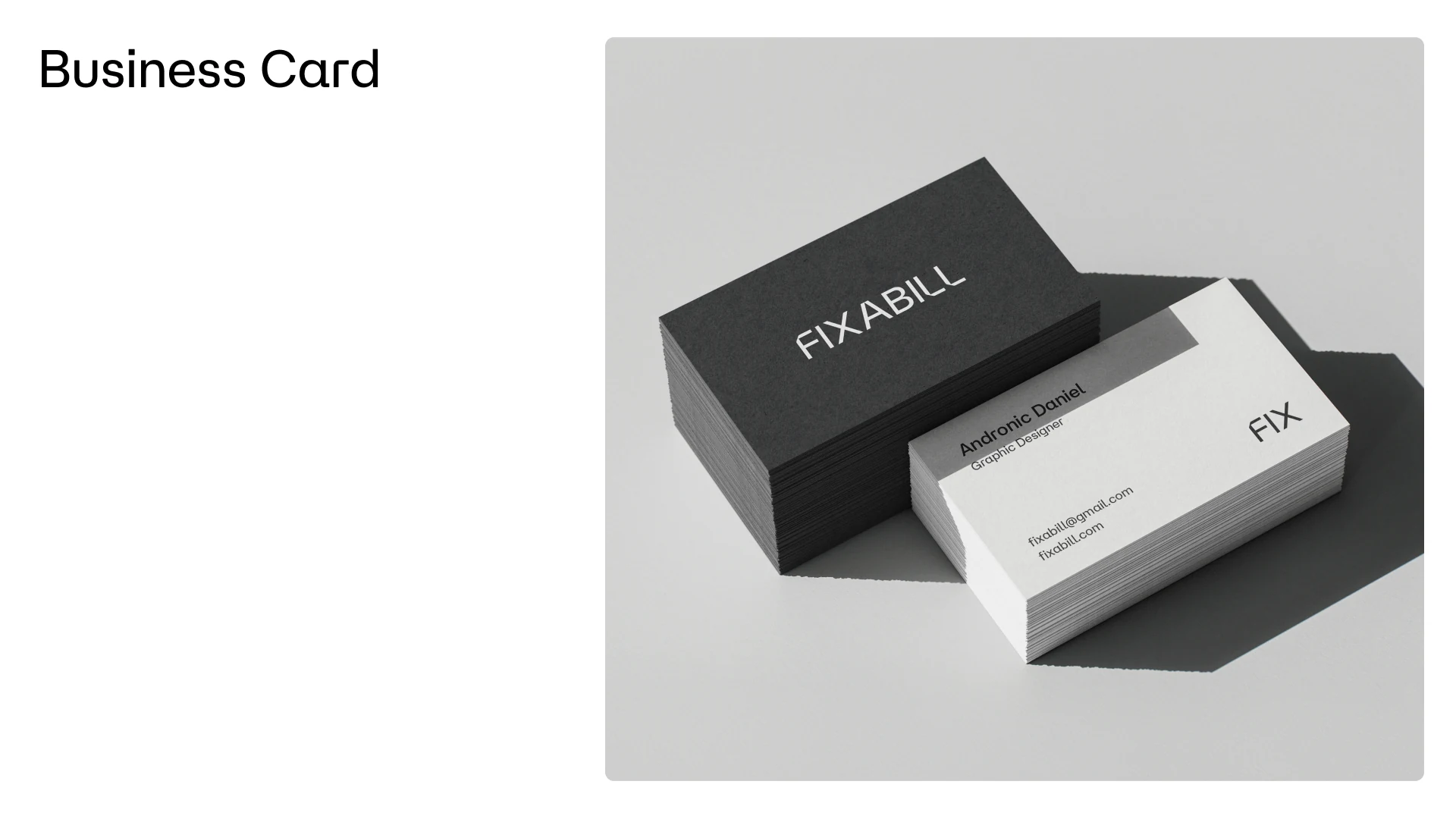
We started with the smallest touchpoints, the favicon and the app icon, and worked outwards. Every element was tested where Fixabill actually lives: the app launch screen, the App Store listing, business cards and social media.
The line “All your car services, one tap away.” gives every touchpoint a clear, confident voice.
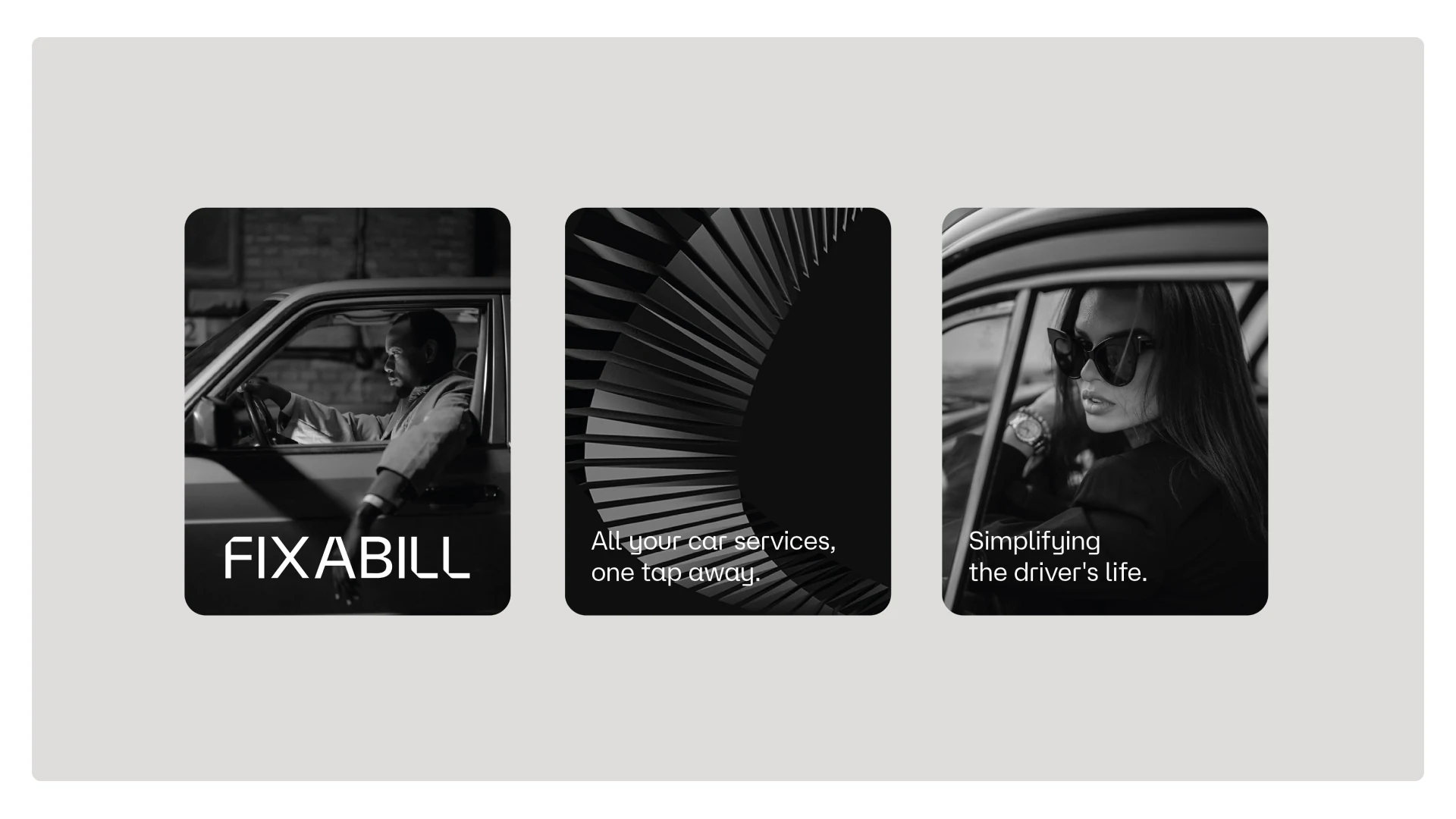
Fixabill now presents itself with one consistent, premium identity across its app, website and social channels, a brand built to make users feel confident from the first impression.