Nuridu
A complete brand identity for Nuridu, an investment and trading company. A sharp geometric mark, Clash Display type and a cream-and-black palette that feel confident and forward-looking.
- Branding
Nuridu operates in investment and trading, a field where credibility is everything. The brand needed to feel established and trustworthy while still standing apart from the conservative, interchangeable look of most financial companies.
Art direction
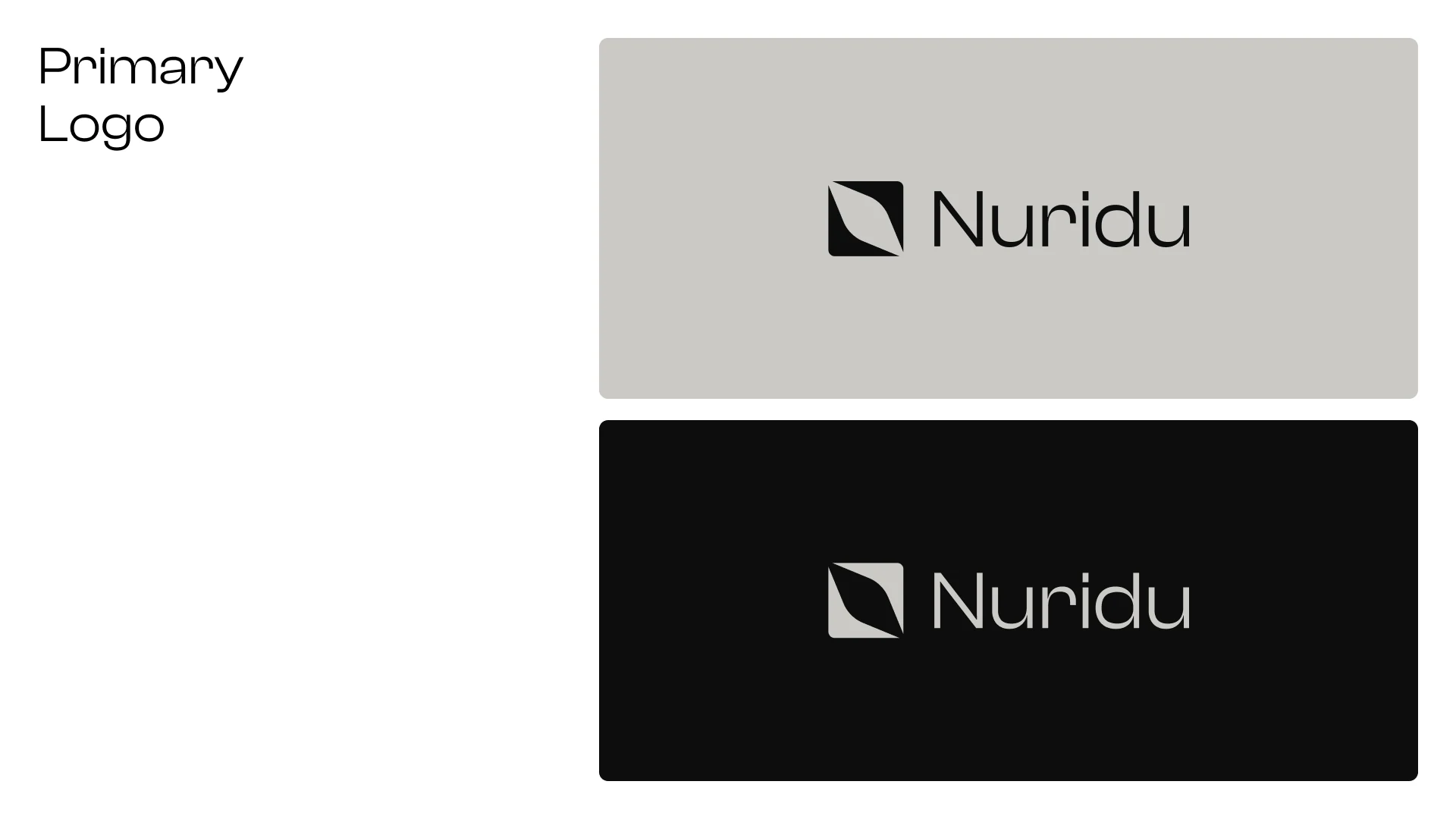
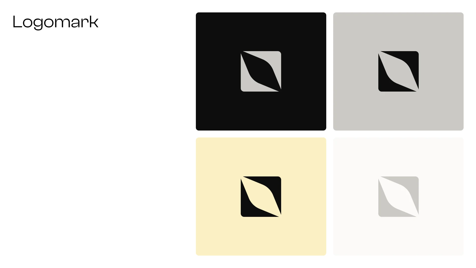
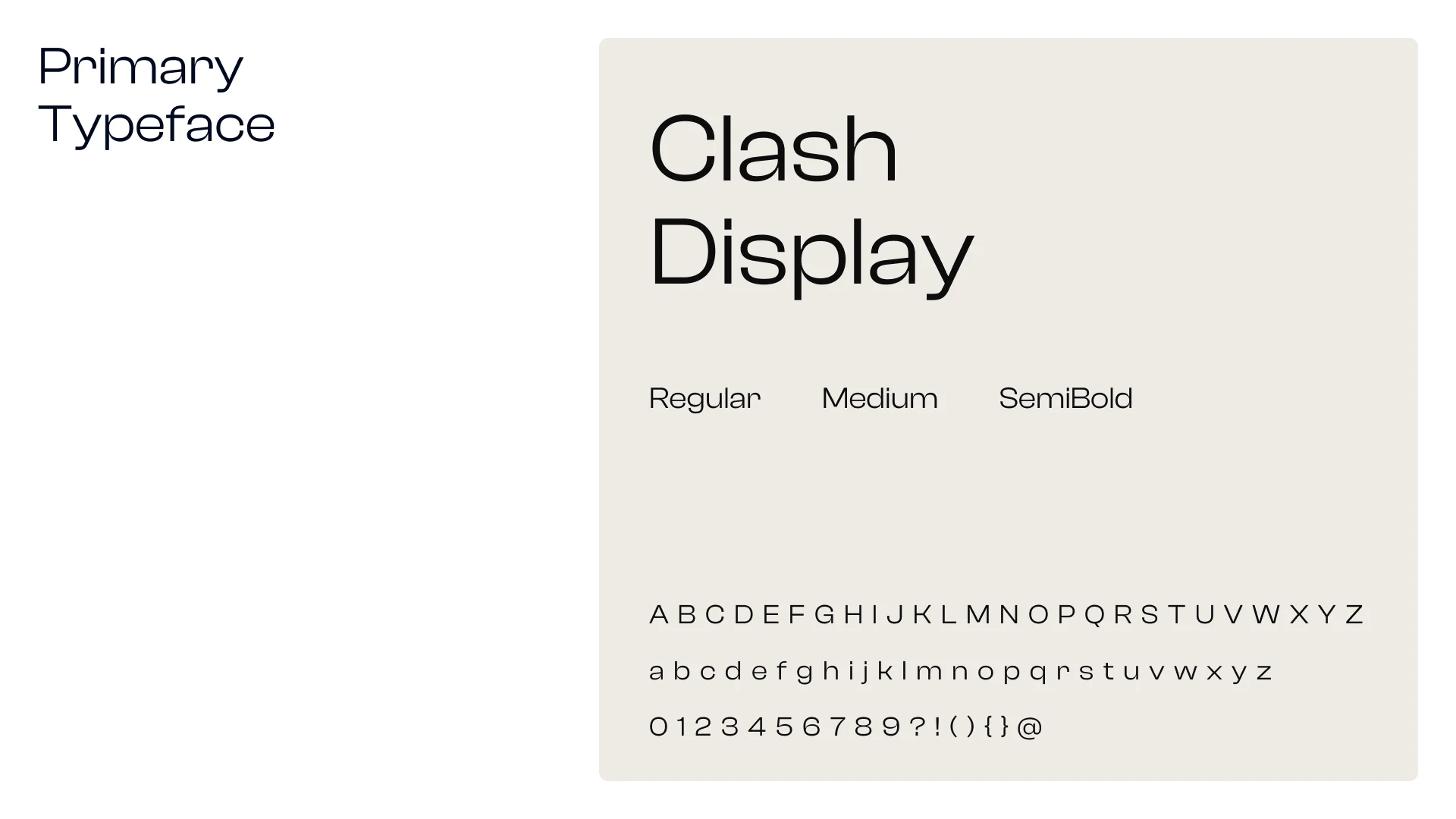
The symbol is a square cut by a single sweeping curve, suggesting growth, motion and a path forward. It pairs with Clash Display, a contemporary typeface with strong character, and stands on its own as a compact mark for small formats.
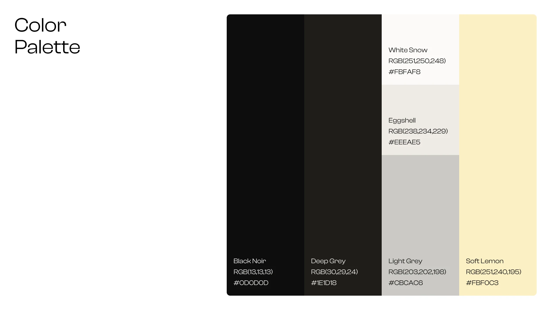
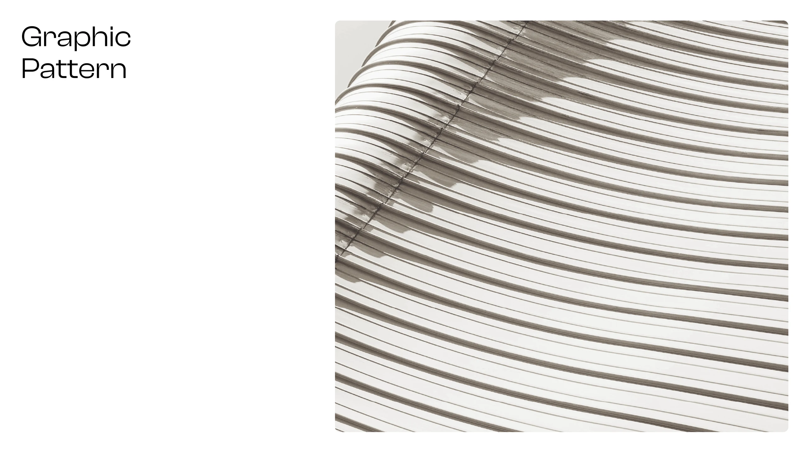
A palette of near-black, warm greys, eggshell and a soft lemon accent gives the brand a calm, premium tone, warmer than typical corporate blue. A flowing striped pattern adds depth and movement to large surfaces.
Creative process
We developed the symbol and wordmark first, then built the typography, colour and pattern system around them. The line “Invest. Develop. Trade. Lead the Future.” gives every touchpoint a clear, confident voice.
Every element was tested on real applications, from a street banner and business cards to a notebook set and social media, so the identity stays consistent as Nuridu grows.
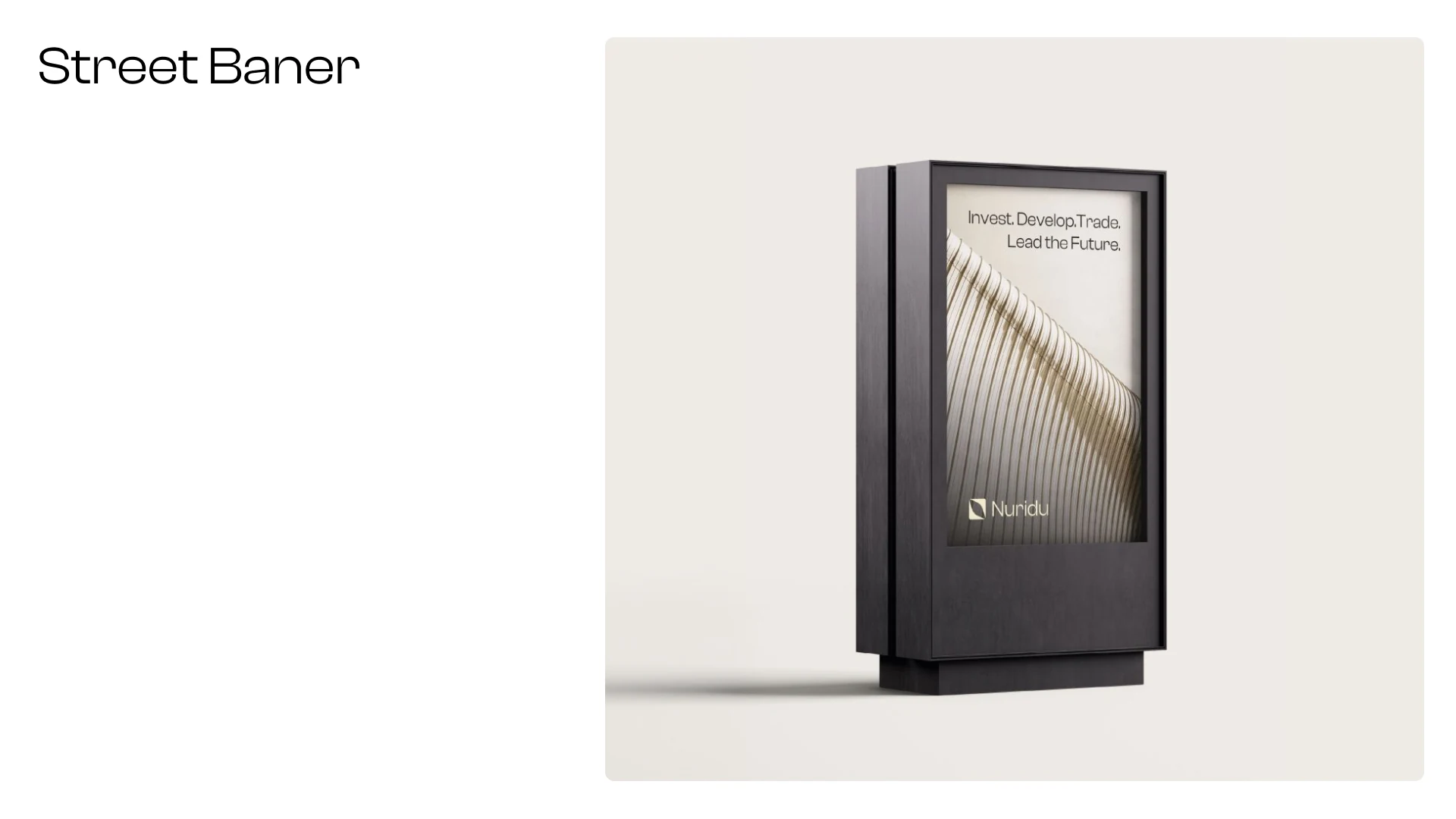
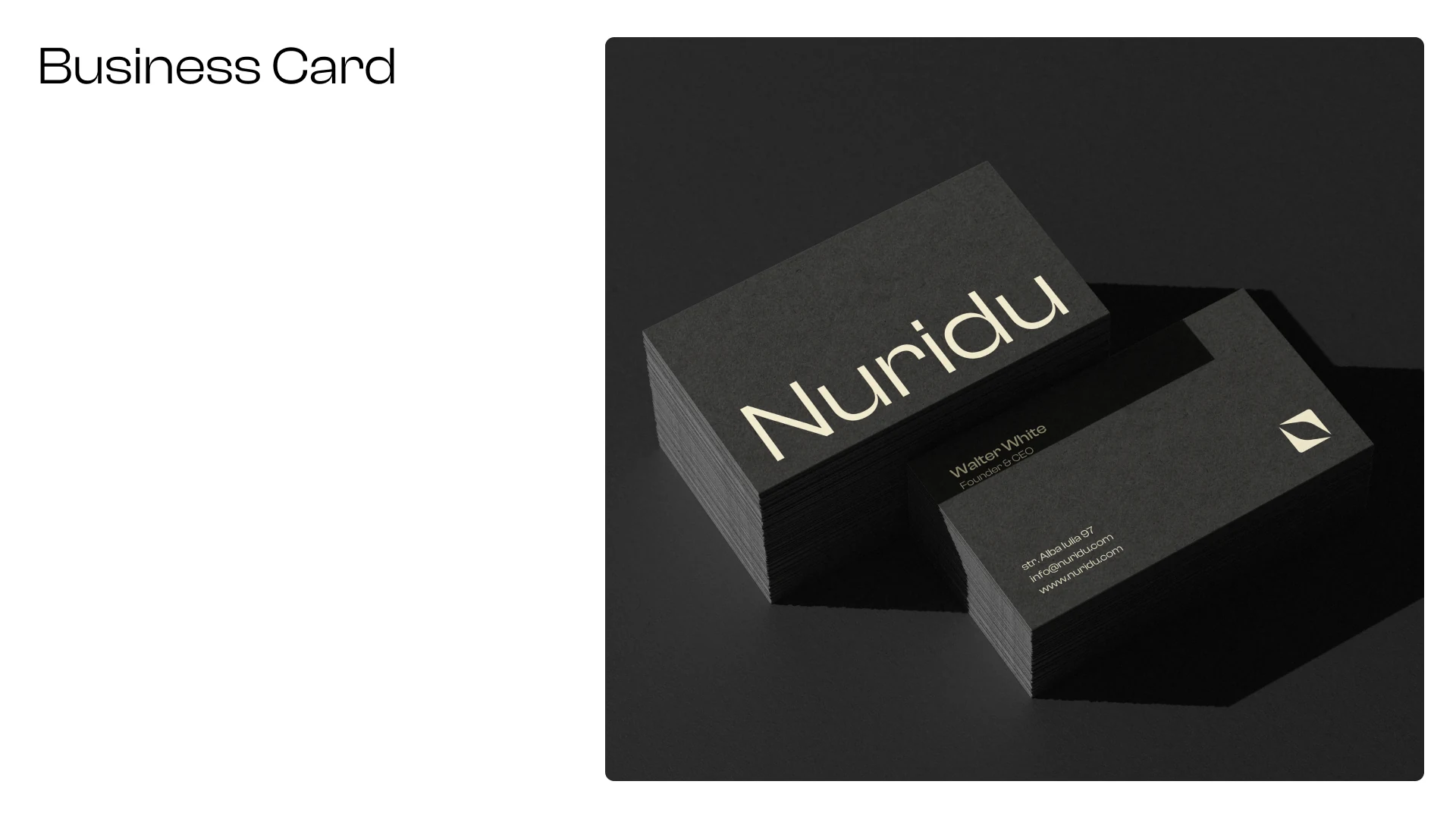
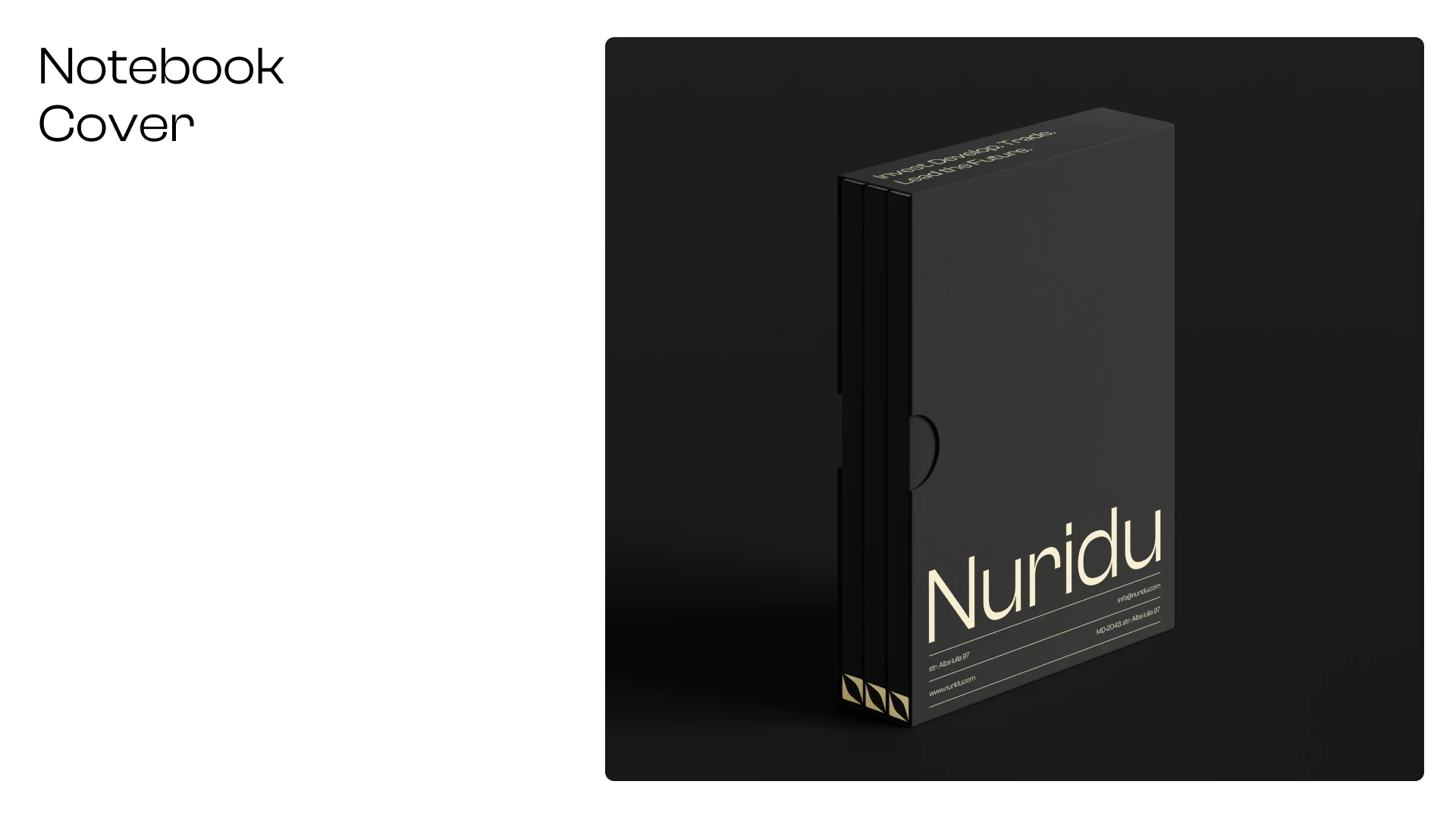
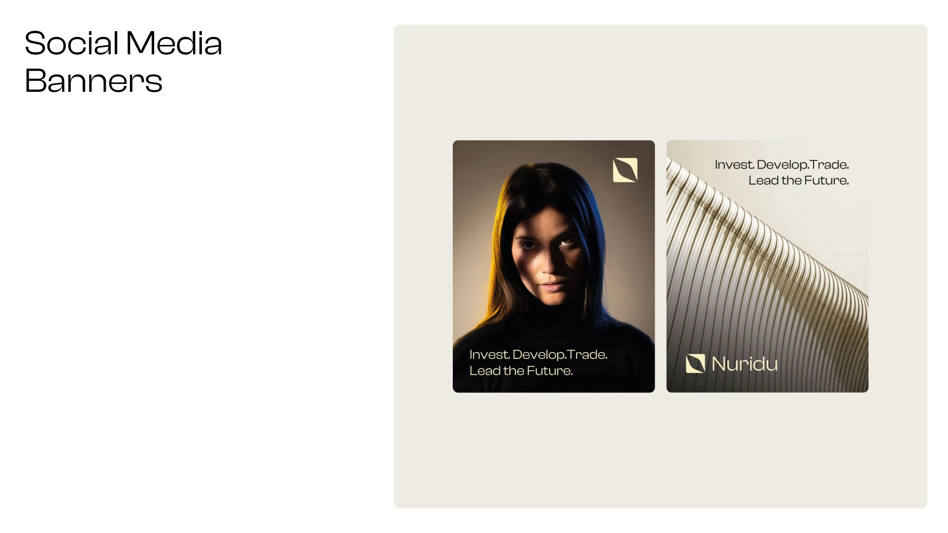
Nuridu now has a cohesive, premium identity that communicates confidence across print, outdoor and digital channels.